the los angeles zoo ︎
client
the los angeles zoo ︎︎︎
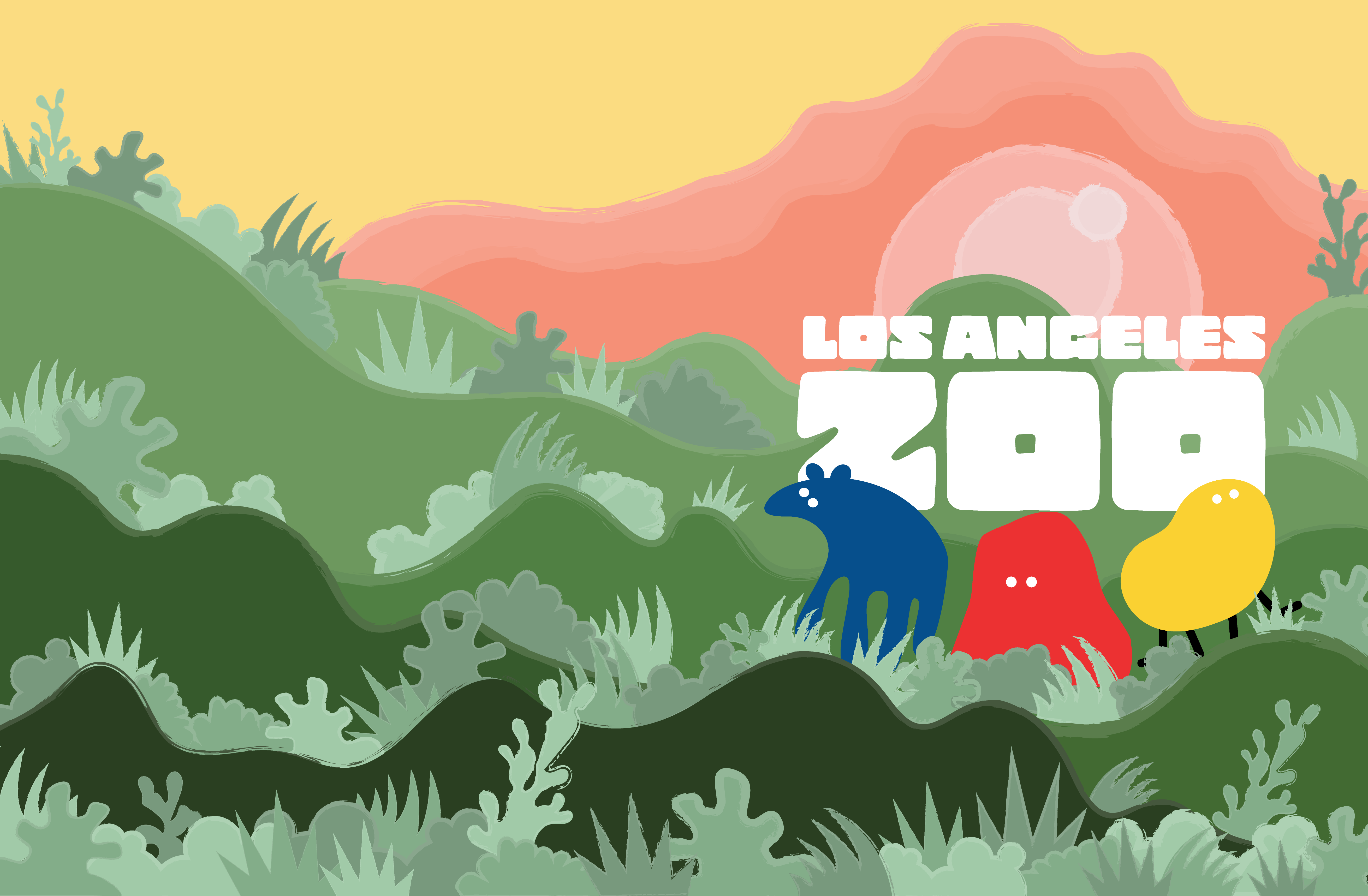
briefThe project was to create a new tone of voice and brand identity for the Los Angeles Zoo. The design aims to emphasize how people and the environment are interconnected and where all life reflects on the organization's focus for wildlife conservation.
understanding the los angeles zoo
I propose to redesign the vision for the brand on how much they do for the safety of animals. Most people do not believe that zoos protect the wildlife, but the Los Angeles Zoo does more than protect, they work to provide a future for the animals and to conserve by rehabilitation with safety.
project completion
spring 2021 - time frame: 3 weeks
tools
adobe illustrator
adobe dimension
fonts used
logo: copal std
body text: duper pro
colors applied
logo
︎ #044F8D / RGB: 4 79 141 / CMYK: 100% 77% 16% 3%
︎ #ED3333 / RGB: 237 51 51 / CMYK: 0% 95% 87% 0%
︎ #FBD233 / RGB: 251 210 51 / CMYK: 2% 15% 90% 0%
others
︎ #F4C9C7 / RGB: 244 201 199 / CMYK: 2% 24% 14% 0%
︎ #F1D9D9 / RGB: 241 217 217 / CMYK: 4% 15% 9% 0%
︎ #F9B3AA/ RGB: 249 179 170 / CMYK: 0% 36% 25% 0%
︎ #F69278 / RGB: 246 146 120 / CMYK: 0% 53% 50% 0%
︎ #F8A48F / RGB: 248 164 143 / CMYK: 0% 43% 38% 0%
︎ #2A4022/ RGB: 42 64 34 / CMYK: 75% 48% 90% 56%
︎ #436A33 / RGB: 67 106 51 / CMYK: 75% 36% 99% 27%
︎ #518243 / RGB: 81 130 67 / CMYK: 72% 29% 93% 13%
︎ #6E995E/ RGB: 110 153 94 / CMYK: 61% 22% 78% 4%
︎ #99CB87 / RGB: 153 203 135 / CMYK: 43% 2% 62% 0%
︎ #A2CBA9 / RGB: 162 203 169 / CMYK: 38% 5% 40% 0%
︎ #84AE8A/ RGB: 132 174 138 / CMYK: 52% 16% 54% 0%
︎ #789A7D/ RGB: 120 154 125 / CMYK: 56% 25% 57% 4%
︎ #293621/ RGB: 41 54 33 / CMYK: 72% 53% 82% 63%
︎ #436A33 / RGB: 252 221 131 / CMYK: 2% 11% 58% 0%
︎ #3D502F / RGB: 61 80 47 / CMYK: 70% 46% 86% 43%
︎ #475B36/ RGB: 71 91 54 / CMYK: 69% 43% 86% 36%
︎ #4F6041 / RGB: 79 96 65 / CMYK: 66% 43% 79% 32%
︎ #5C6E4A / RGB: 92 110 74 / CMYK: 63% 39% 78% 24%
︎ #71699B/ RGB: 113 105 155 / CMYK: 63% 63% 15% 1%
︎ #706F6D/ RGB: 112 111 109 / CMYK: 56% 49% 50% 16%
︎ #4A4A4B / RGB: 74 74 75 / CMYK: 65% 59% 57% 39% 32%
︎ #383938 / RGB: 56 57 56 / CMYK: 69% 62% 61% 54%
logo redesign
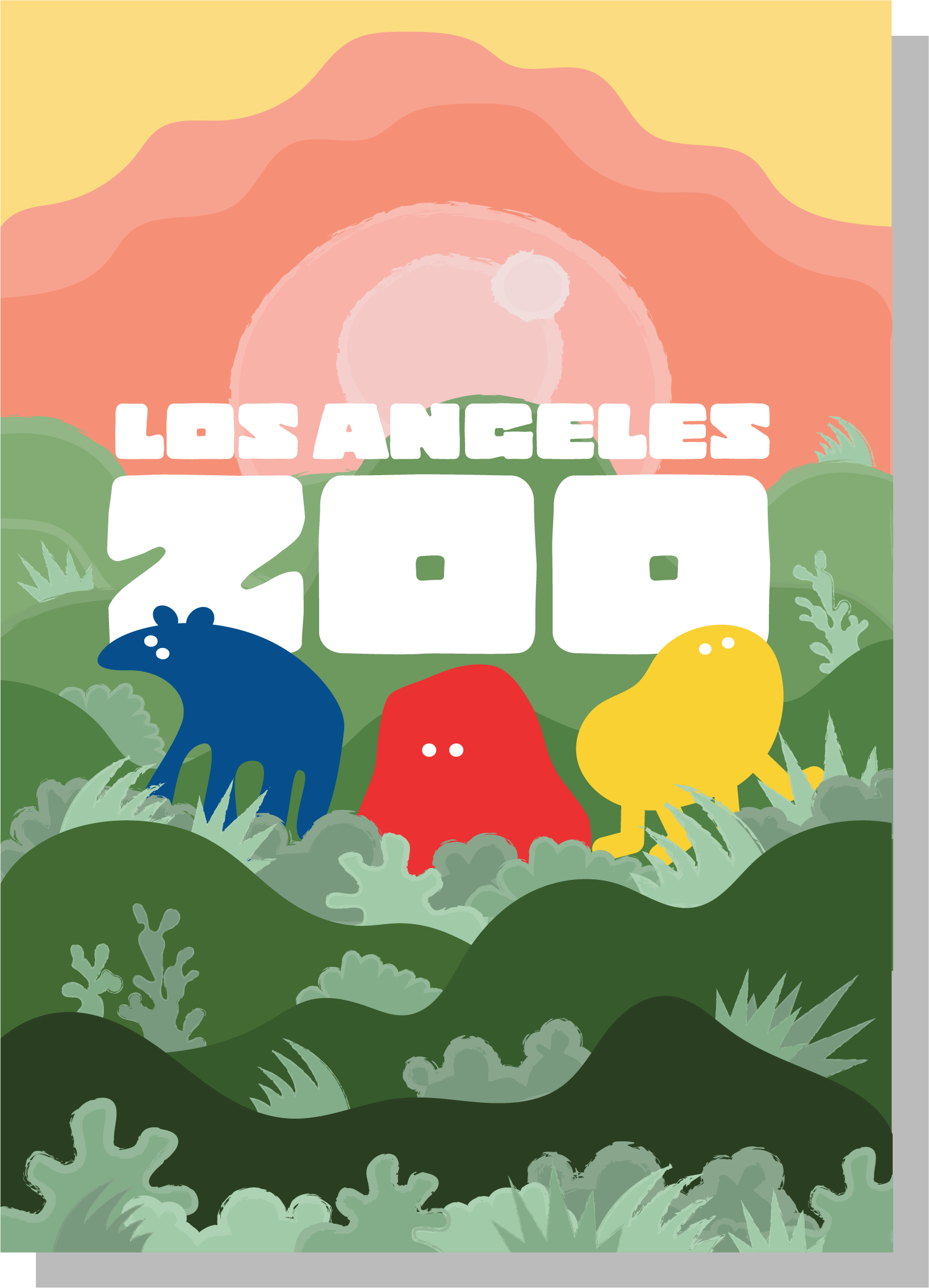
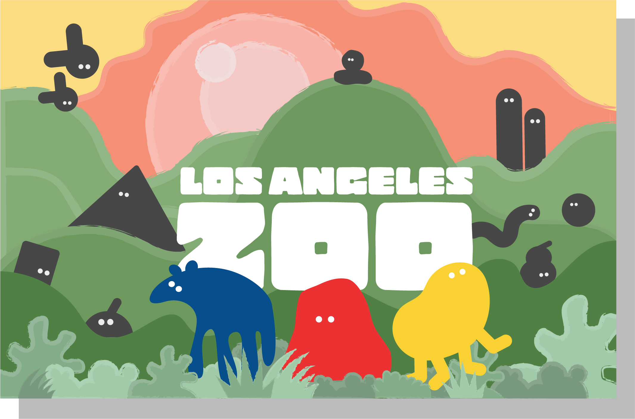
Presenting a more ambiguous logo to represent the playful aspect of the zoo - to welcome open arms for all ages. The logo's three animals are hugely important to the history of the Los Angeles wildlife and to "represent its century-long conservation efforts." With the rebranding, the design allows to connect with the broadest audience possible—from the families who visit and support the Zoo and to the scientific community who help contribute to its research. The design of the Los Angeles Zoo is to save species worldwide, and to balance this with a new name that was inspiring and sparks curiosity.
Presenting a more ambiguous logo to represent the playful aspect of the zoo - to welcome open arms for all ages. The logo's three animals are hugely important to the history of the Los Angeles wildlife and to "represent its century-long conservation efforts." With the rebranding, the design allows to connect with the broadest audience possible—from the families who visit and support the Zoo and to the scientific community who help contribute to its research. The design of the Los Angeles Zoo is to save species worldwide, and to balance this with a new name that was inspiring and sparks curiosity.


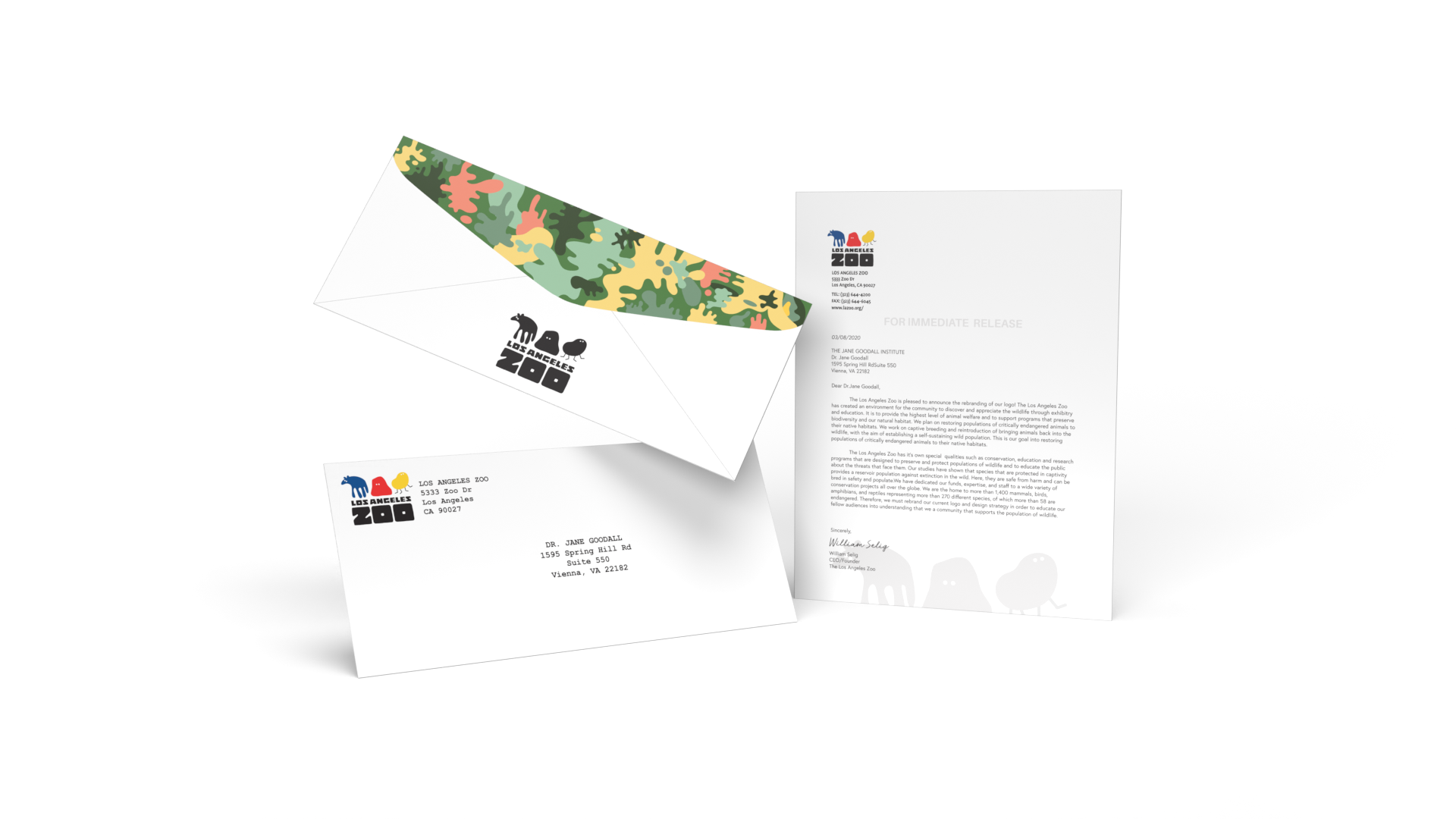
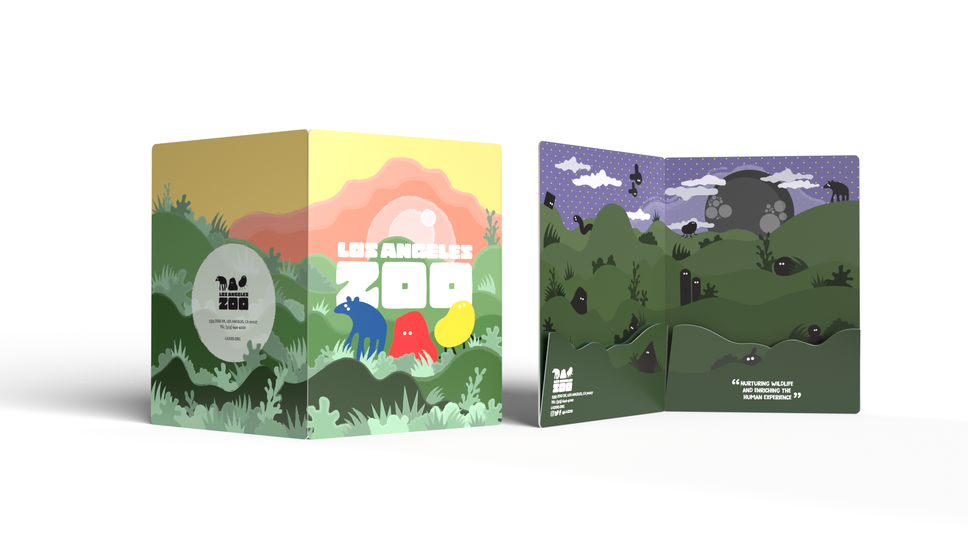
stationary set development
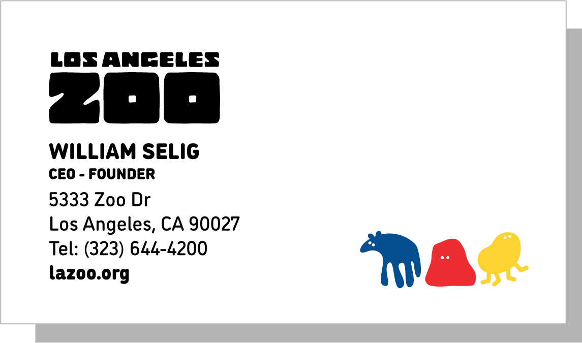
business cards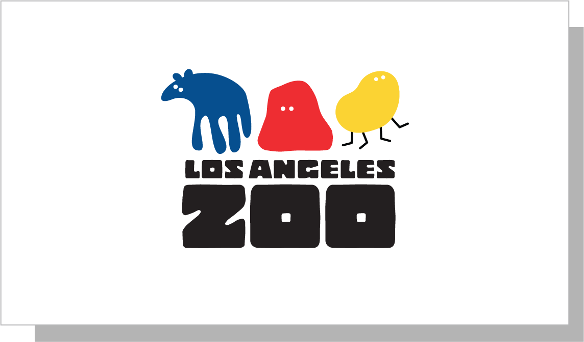
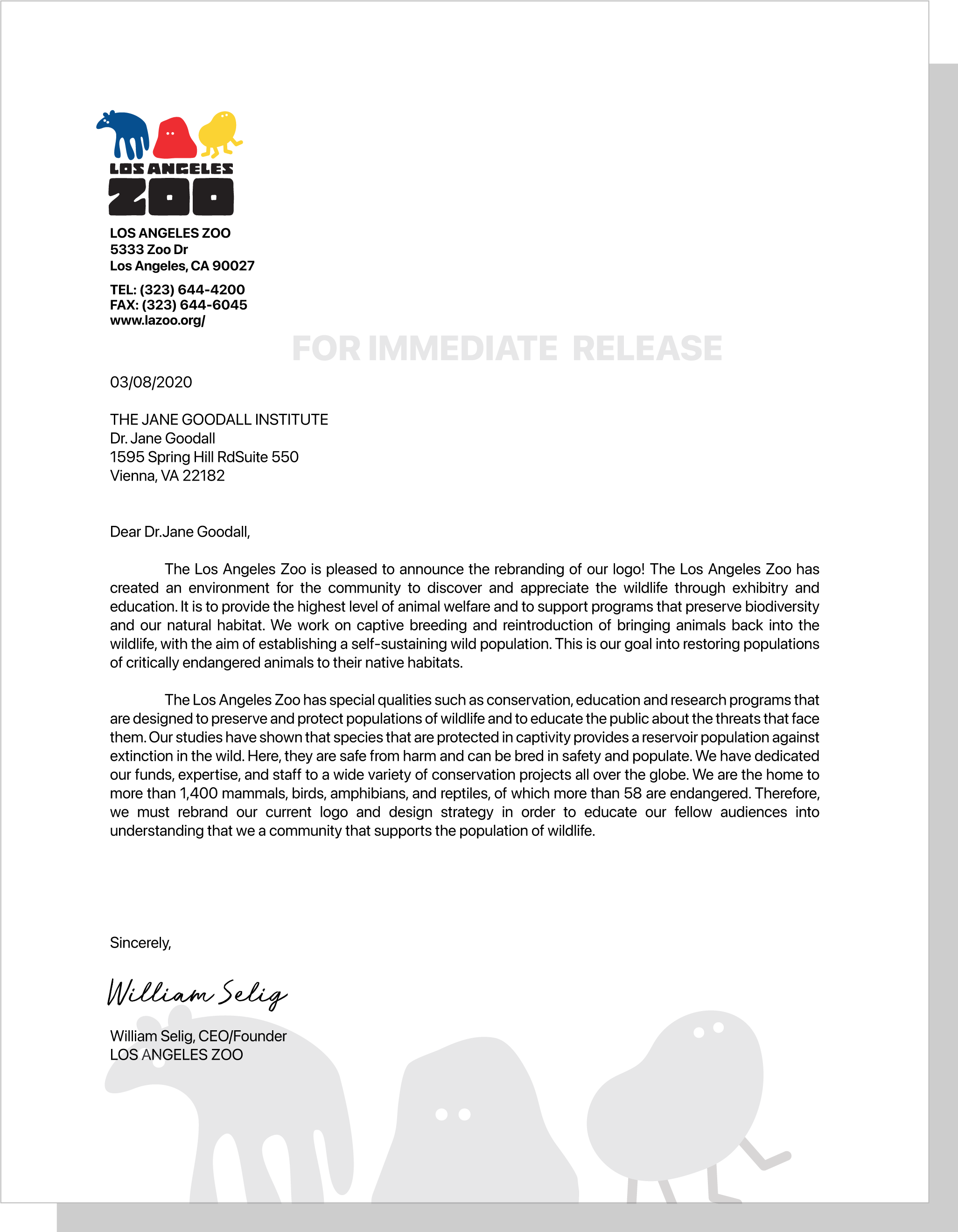
company letter
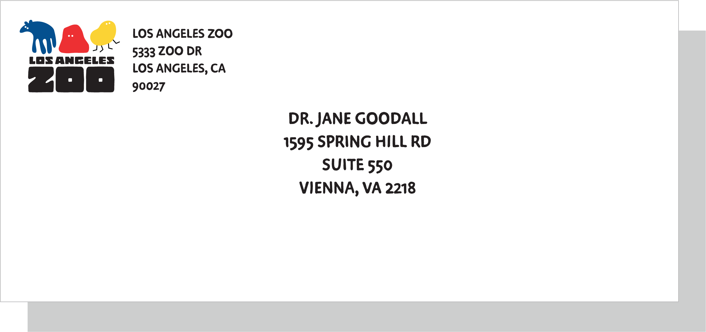
envelope

company folder
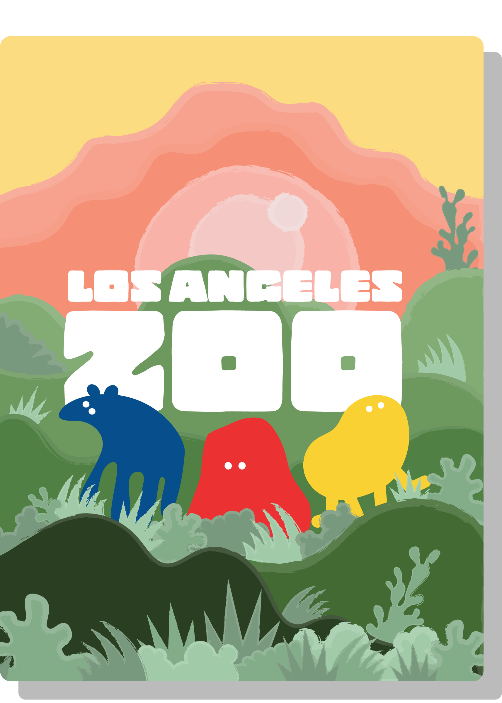
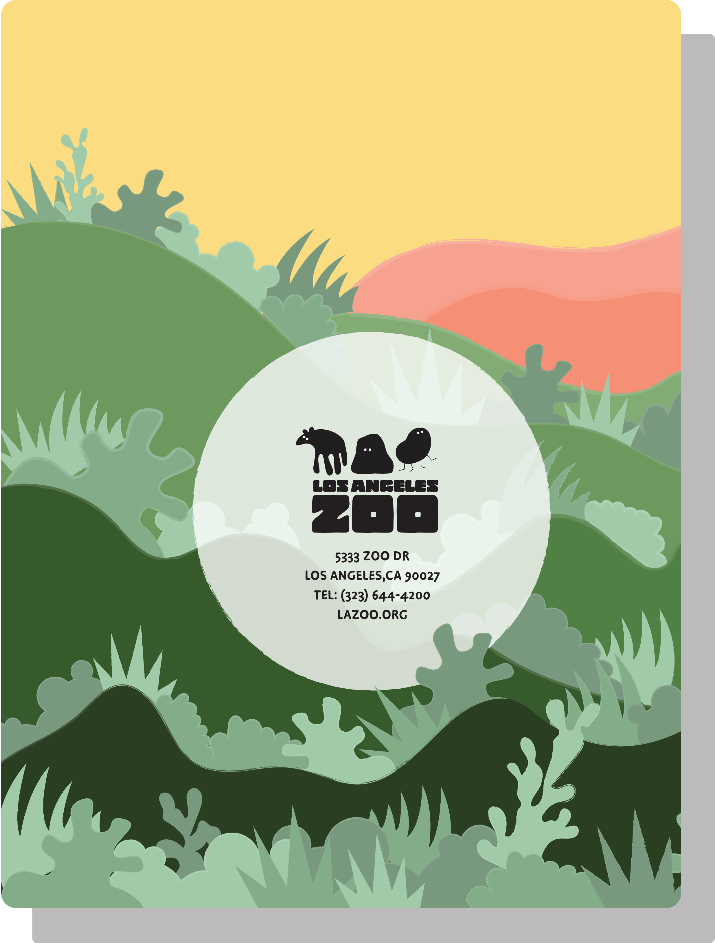
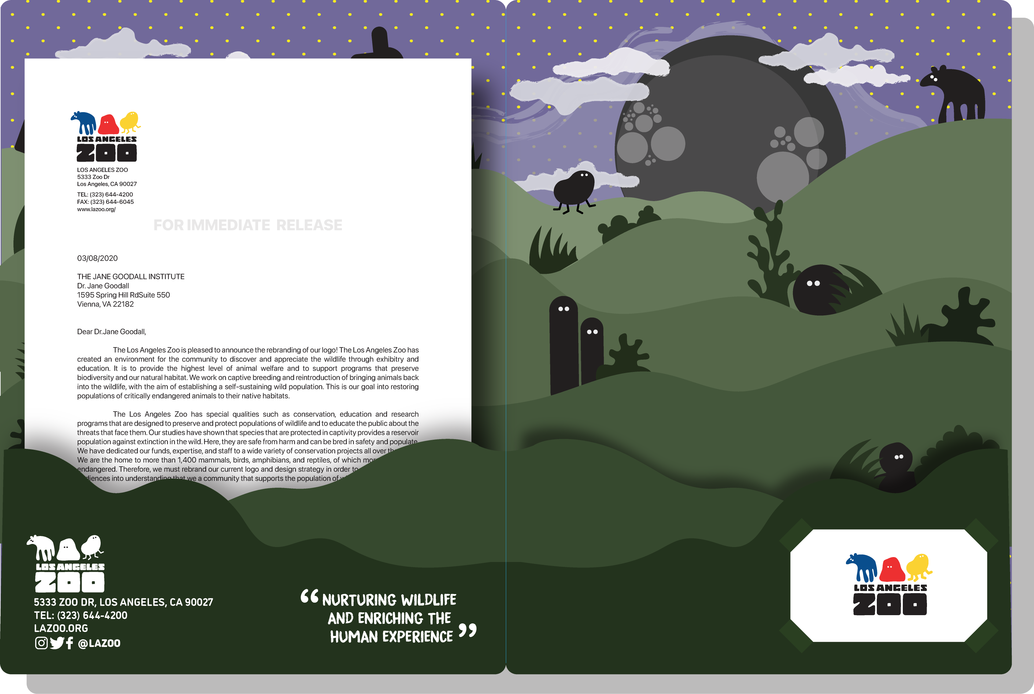
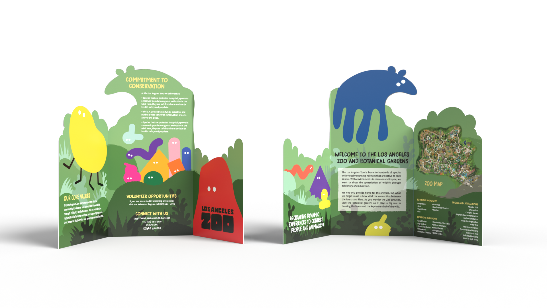
bi-folder
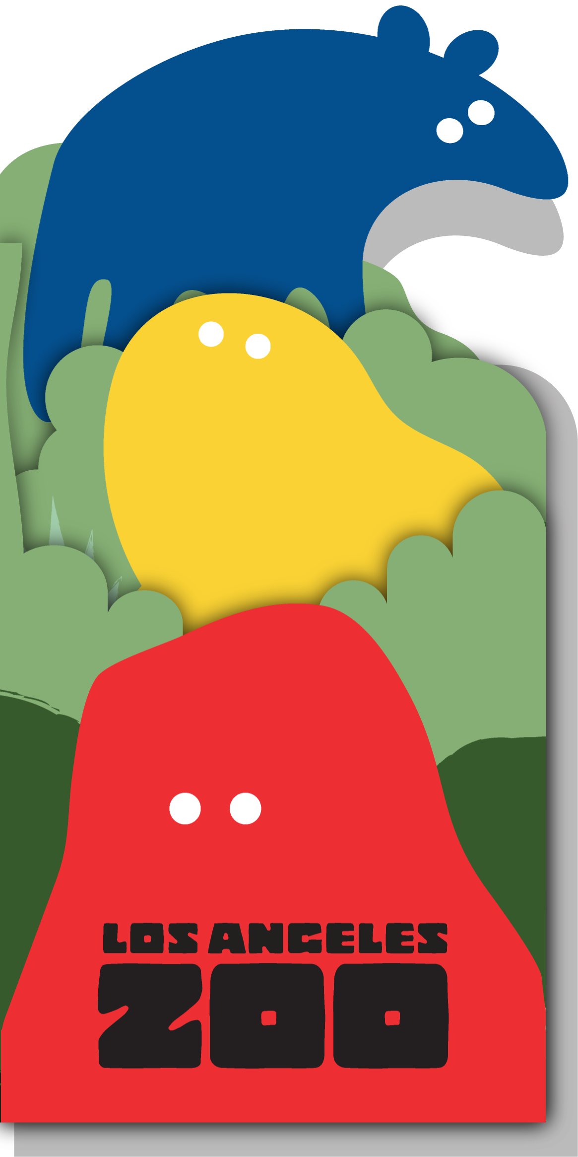

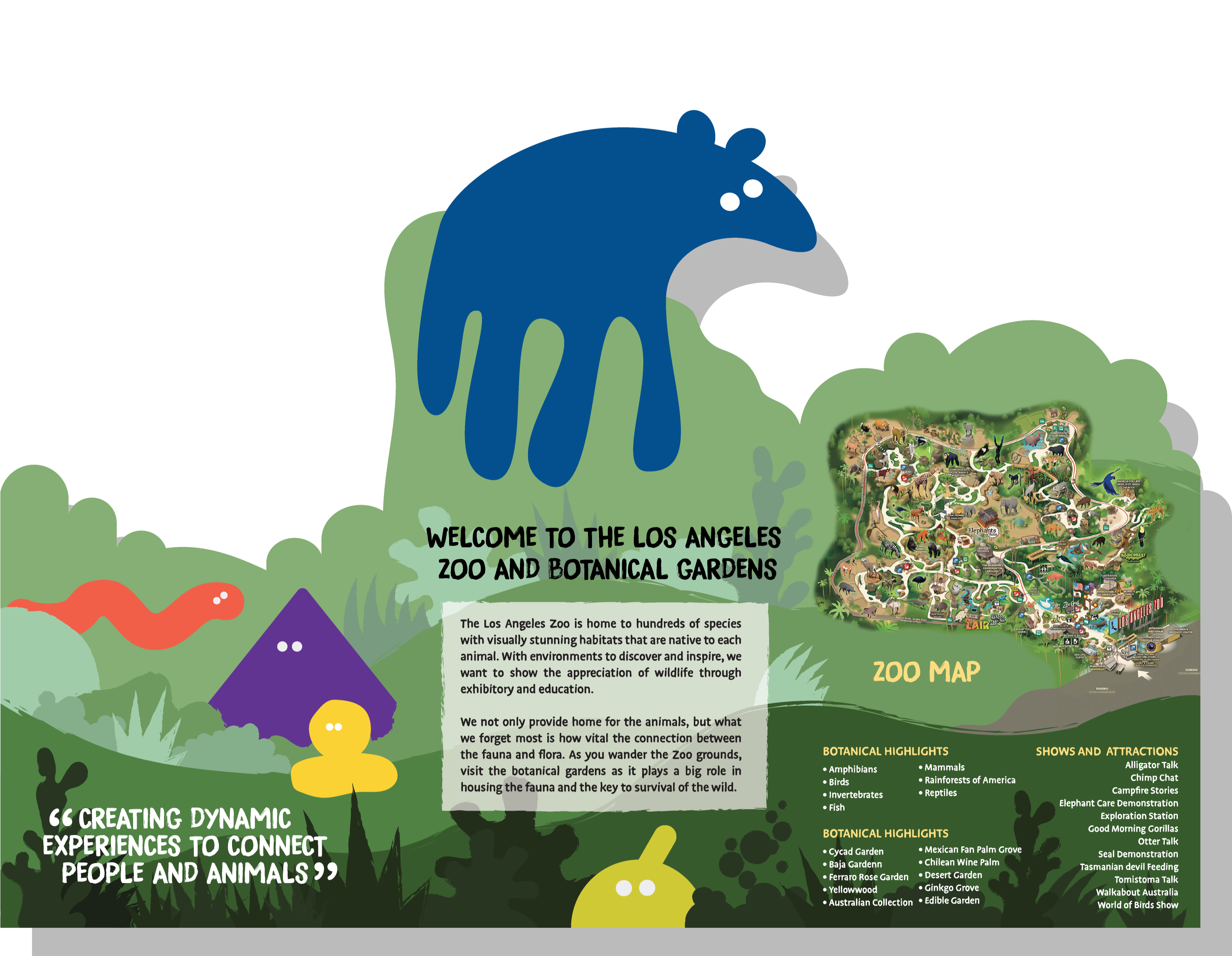

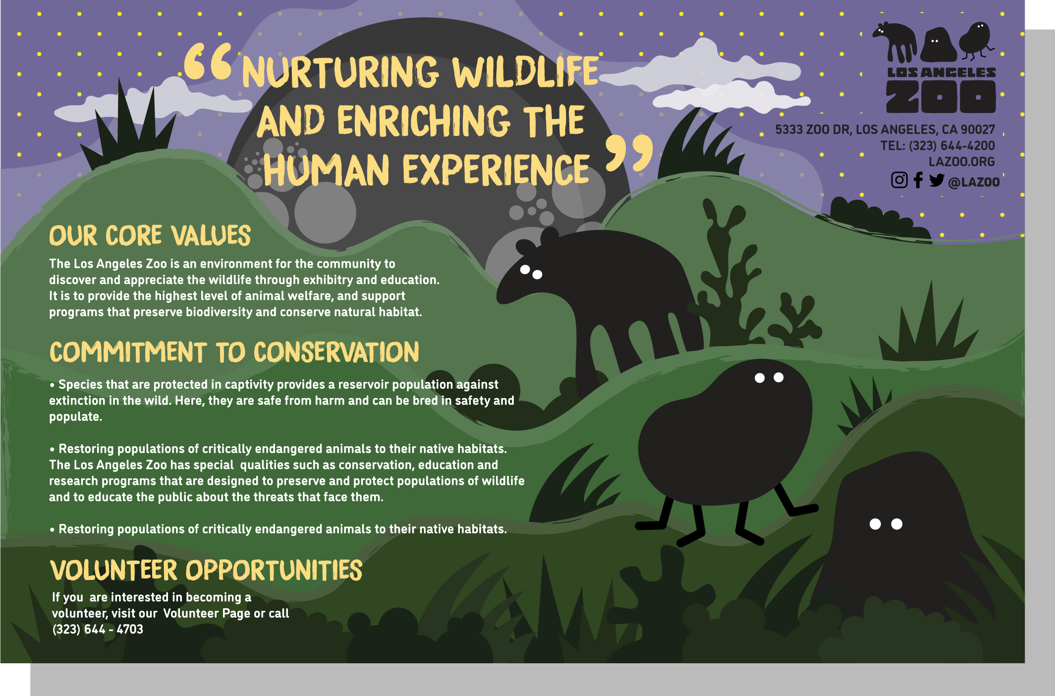
los angeles promotional flyers
