greystone mansion ︎
briefThe new Greystone Mansion site must be responsive . Currently the Greystone Mansion does not have a separate site, but it part of the beverlyhills.org. While this makes sense since it’s a Beverly Hills landmark, finding information about the house within the current structure of beverlyhills.org is confusing and does not live up to the mansion’s brand. Greystone deserves its own online destination.
As part of this effort look at
combining features and content from:
︎︎︎ greystone mansion website
︎︎︎ beverly hills
In addition, our team wanted to further extend the new site features and content so that it captures the elegance, the rich history and the current-day abundance of activities and offerings that make Greystone so magical.
company missions statement
“The mansion’s historic architecture, lush grounds and spectacular views are enjoyed and available for all today, tomorrow and for years to come.”
tools
figma
adobe illustrator
project completion
fall 2020
team members + roles
Renee Aahlen - web developer
Maribel Hernandez - team leader
Maegan Iamjan - lead designer
figma
adobe illustrator
project completion
fall 2020
team members + roles
Renee Aahlen - web developer
Maribel Hernandez - team leader
Maegan Iamjan - lead designer
let me introduce you to my team.

renée aahlén web developer

maribel hernández team leader

maegan iamjan graphic designer
creative brief & stakeholder research
inspirationWe used the sites that the stakeholder shared they felt inspired them in order to create a Heuristic and competitive audit.
personasBased on the characteristics that the stakeholder shared, we created personas that identified with those characteristics.
brand identityWe took into account the brand’s promise and “the mansion’s historic architecture, lush grounds and spectacular views” in order to design the web and mobile layout.
photo gallery
The stakeholder shared that they wanted to showcase their photos better, therefore we implemented a “Gallery” page that includes a virtual tour and various photos of the groundsite for those who want to rent and book the mansion.
The stakeholder shared that they wanted to showcase their photos better, therefore we implemented a “Gallery” page that includes a virtual tour and various photos of the groundsite for those who want to rent and book the mansion.
website integration
The brief indicated that Greystone deserves its own “online destistation,” therefore we implemented ideas from the Friends of Greystone website and the Beverly Hills Website to produce one cohesive website.
The brief indicated that Greystone deserves its own “online destistation,” therefore we implemented ideas from the Friends of Greystone website and the Beverly Hills Website to produce one cohesive website.
simplifyWe simplified the website in order to make it user-friendly for users who are not tech savvy and would be able to easily navigate the site.
heuristic & competitive analysis
the ebell of los angeles, falling water, & greystone mansion
overallCompetitive sites display a happy, fresh, and high-end location as it highlights, property with stunning photos along with people using the site in motion. It gives a high standard of what the estate is.
content qualityThe Ebell has more simple and clear paragraphs with straightforward information. Fallingwater is very text-heavy, although easy to catch headers due to the clear hierarchy. Both sites are very formal and educational.
homepageThe Ebell’s homepage real estate is very user-friendly and easy to navigate. Fallingwater has a silent running loop video that overlooks the property. Both competitors invite users to an emotional level.
visual designColors and style remain the same and cohesive throughout the website. There are high-resolution and up-to-date images and videos.
navigationA simple header at the top of the site allows for a quick understanding of the site. Main labels and sub-labels are clear and concise. Fallingwater has too many subpages menu items, but it is organized well.
features & functionalityThe Ebell includes a member login, which is convenient for those that need to access their personal information on the site. Fallingwater has interactive features such as loop videos. Both competitors have a search bar for convenience.
user interviews → insight summary
too many pagesTo book events, try to simplify the subpages into one main. The user tends to get lost going through so many extra pages.
highlight the gardenThe architecture and garden outside surrounding the mansion were worth the visit by themselves while the inside wasn’t mentioned.
simplify navigationInclude only the most important items, links, and information on the site by making it simple to understand and navigate.
lots of confusionUnsure, unclear explanation of what Friends of Greystone is. It is confusing if it is for a membership program, but it is a non-profit organization. It needs to be stated clearly on what it is.
visitation is key to websiteThe strongest reason for the visit of the website before going to GMBH was to view the open hours, instructions about parking and fees.
include virtual tourInclude a virtual tour option, given that we are now in these difficult times where we cannot physically visit the location. It will be helpful to visitors now and in the long run.
personas, experience maps & card sort
personasTamara

Location
Beverly Hills, CA USA
Age
28
Occupation
Director of Communications of the Los Angeles Rams
Key Findings
- Images are important to showcase on-site
- FAQ to be simplified and easy to navigate
- Virtual Tours are a plus given the current circumstances
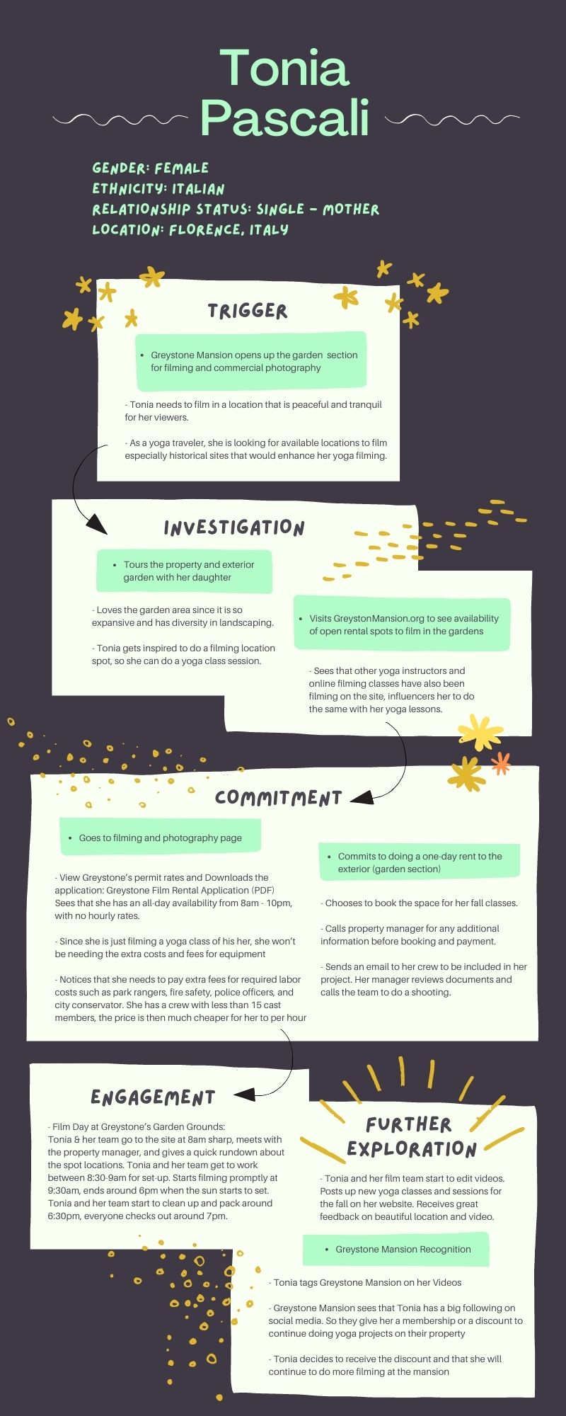
Tonia

Location
Florence, Italy
Age
32
Occupation
Yoga Business Owner & Instructor
Key Findings
- Essential to have an “Event Calendar” to check the availability of premises
- Add a “rental” page for easy access to booking information
- Social Media needs to be highlighted better
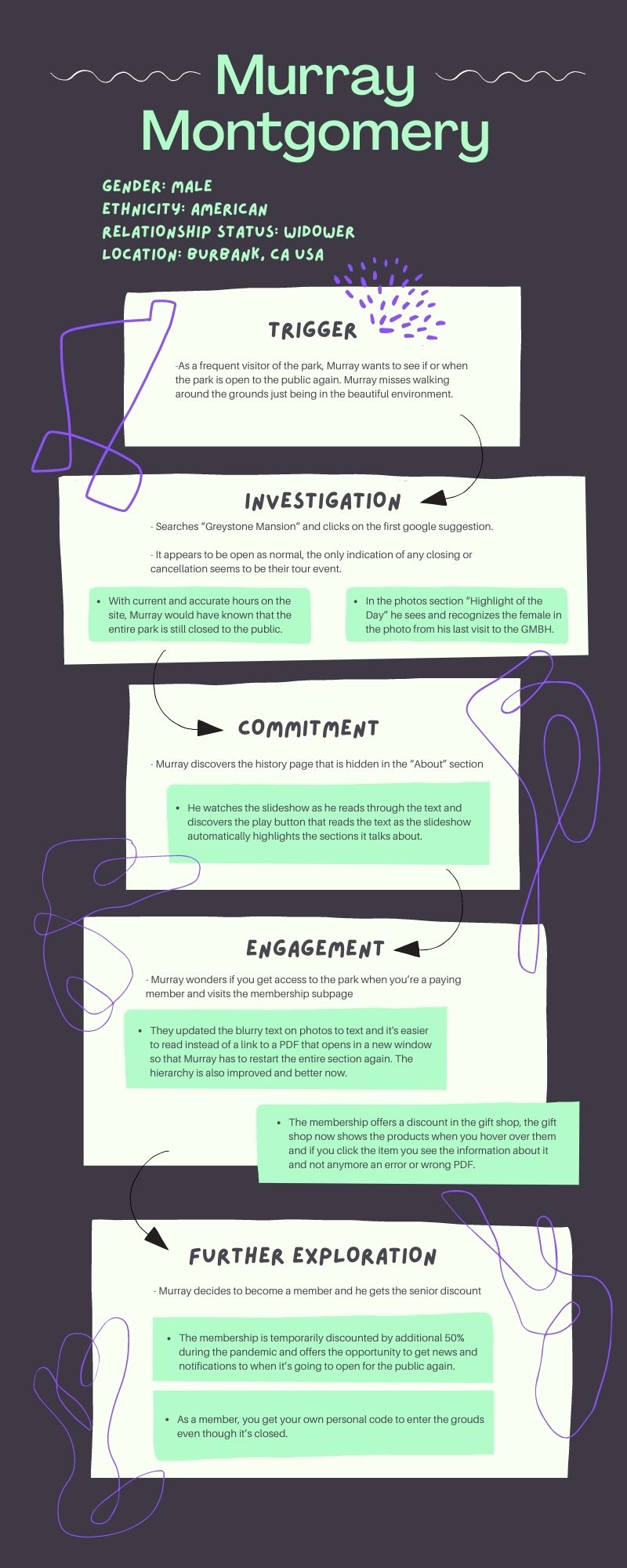
Murray

photo credit︎︎︎
Location
Burbank, CA USA
Age
67
Occupation
Construction & Retired Veteran
Key Findings
Location
Burbank, CA USA
Age
67
Occupation
Construction & Retired Veteran
Key Findings
- Make contact information easy to find on the site
- Embed the images, instead of making a PDF download
- Include images and prices of the products in the gift shop

experience map highlights
book it
The interest to book an event at the mansion is important and it needs to be clear where to view what dates are available and what the price range would be for the event.
photo galleryTo be able to view photos was something all of our personas wanted during the experience maps and they all wanted to view the surrounding areas of the mansion grounds.
card sort & insight summary
organization There are several ways to organize a site depending on who you ask and on how pages are named grouping Some pages may be similar and logical to group together while other pages are better standing alone.processGiving the participant liberty to add or eliminate as many cards as they needed was important to see their thinking process.
renaming Allowing the participant to rename or add new pages was eye-opening because one-word descriptions play an integral role in how user-friendly the site is.
pages User organized sections based on simple organization, not too many extra tabs.


content inventory spreadsheet


content inventory highlights
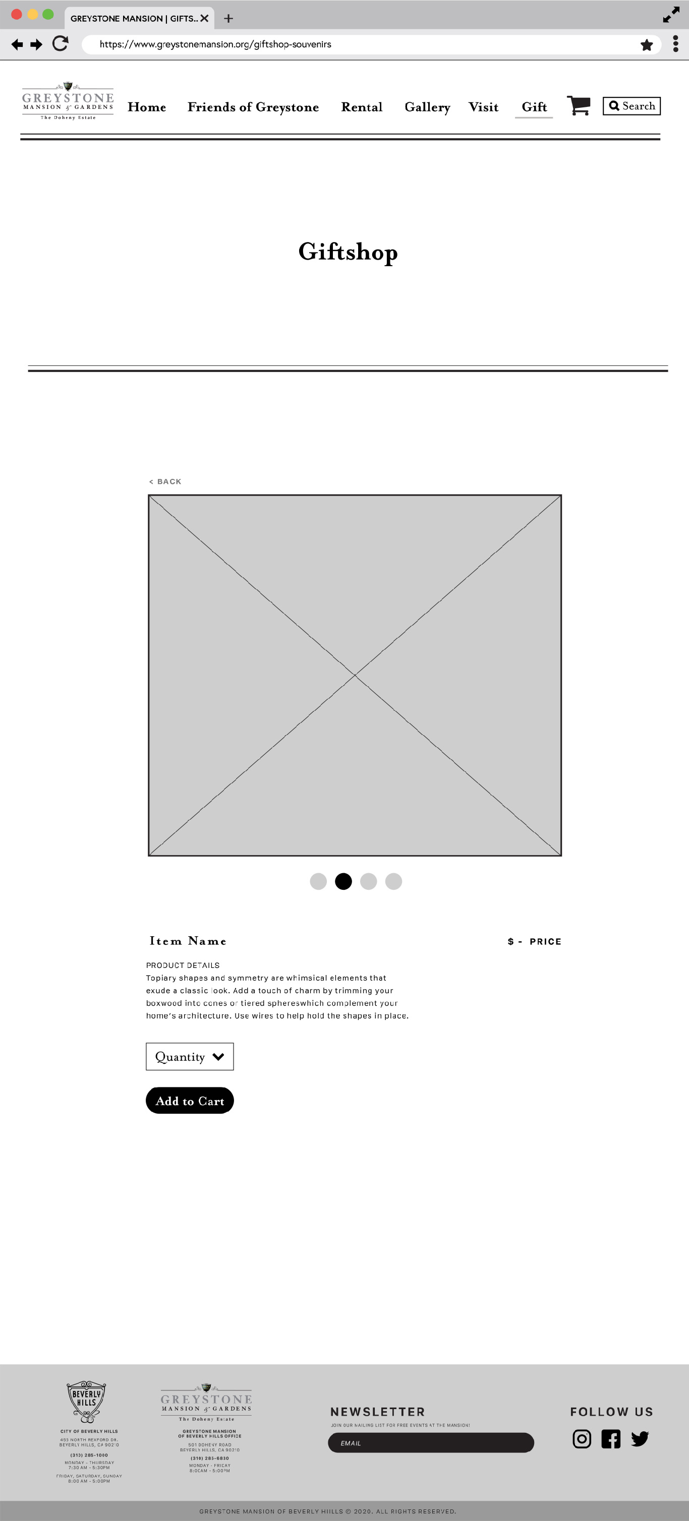
giftshop
Page is not currently working - 404 error on the cart.
The page indicates that it is not selling online. There is a wrong pdf linked.
restoration
Extremely out of date. Needs better photos.
eventsThere are images missing or videos, needs better quality visuals.
The page needs to tell visitors if events are allowed to be reserved due to today's current regulations (COVID19).
final feature matrix
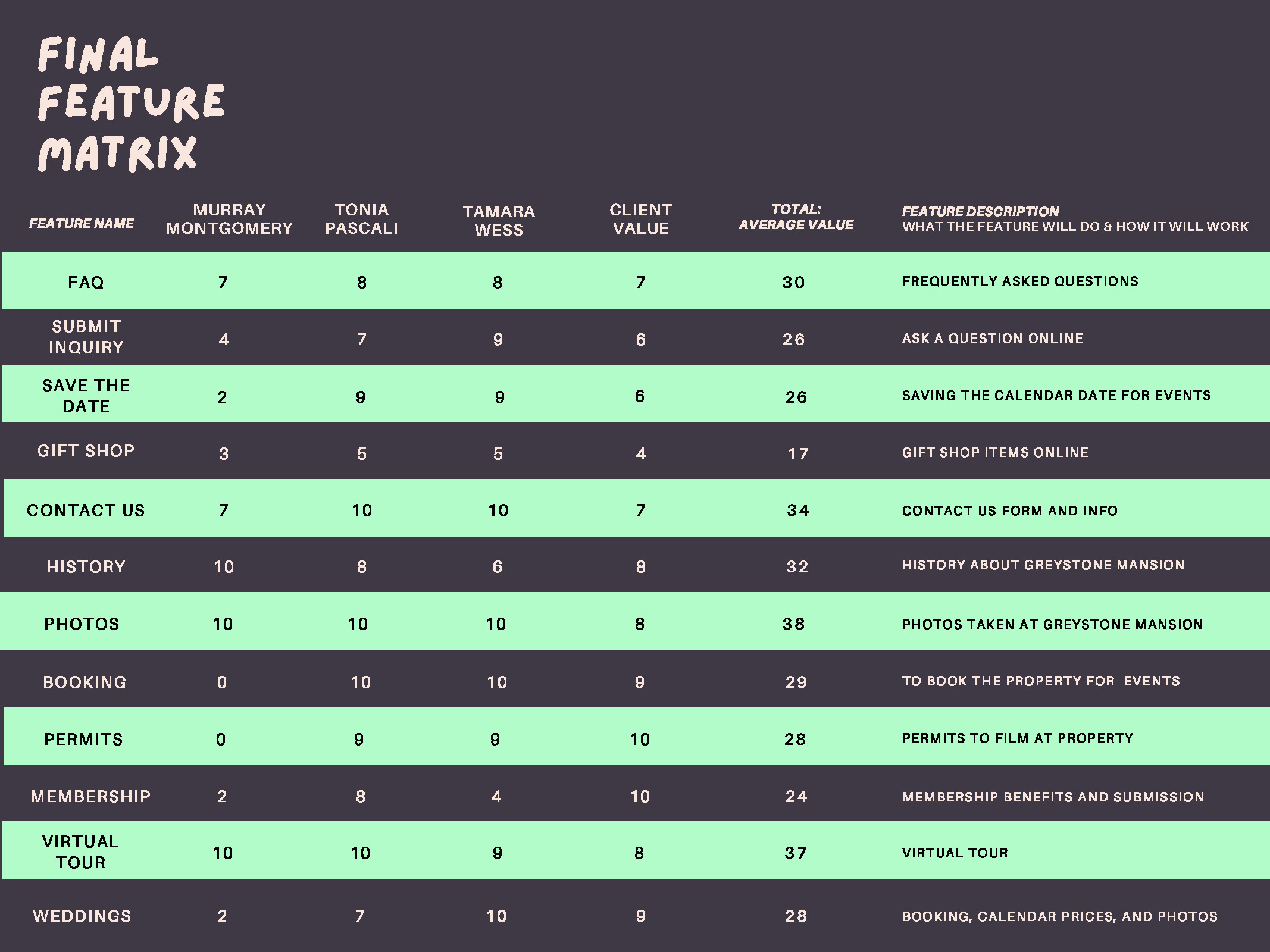
gallery The option to view photos on GMBH website ended up with the highest value point (38) for our personas.
virtual tour With only 1 value point difference the virtual tour landed a second place over important site features
gift shop The gift shop received the lowest score throughout the feature matrix with only 17 value points.
final site map

team goals
- Keep simple and user-friendly
- Highlight and showcase important information
- Must include an event calendar
prototype - low fidelity


home/landing page

visit us

friends of greystone

frequently asked questions

gallery

giftshop
giftshop - item look up
prototype 2.0 - possible color palettes